
01
PROJECT OVERVIEW
Increasing conversion on one of Pizza Hut's highest-revenue digital experiences.
The Deals page was one of Pizza Hut's highest-traffic digital experiences, yet it wasn't converting as many customers as expected. As promotional campaigns expanded, the experience became increasingly difficult to understand, making it harder for customers to confidently choose a deal.
Instead of proposing another large redesign, I reframed the problem around customer decision-making. Using behavioral research and experimentation, I identified low-risk opportunities to improve deal comprehension and conversion.
My Role
Led UX strategy, partnering with Product, Research, Merchandising, and Engineering to shift the team's approach from large redesigns to measurable behavioral improvements.
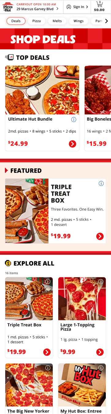
Deals Page - Before

02
APPROACH & USER RESEARCH
Start with evidence, not assumptions.
Before designing anything, I synthesized existing heuristic evaluations, usability studies, and CRO findings to identify recurring behavioral patterns instead of repeating research.
Heuristic Evaluations
Weak visual hierarchy
Hidden deal contents
Similar-looking promotional tiles
High cognitive load
Usability Studies
Users opened deals just to understand what was included.
Comparing offers required memory.
Price alone wasn't enough to communicate value.
CRO & Behavioral Analytics
High exploratory clicks
Frequent backtracking
Low decision confidence
I believed the biggest opportunity was improving the fundamental building block of the page: the deal tile.
If customers could understand a deal at first glance, they could compare offers with less effort and make faster decisions.
I focused on three principles:
Hierarchy:Make important information immediately visible.
Price prominence: Better communicate value.
Deal summaries: Surface included items before entering the builder.

Everything competes equally for attention.
Pricing lacks hierarchy; no anchor for value comparison
Promotions blended together visually
Deals Page


What’s included?
Back and forth
repeatedly
Customer taps to open deal
How does this deal compare to others?
Deal Builder

Comparing deals required memory
Users had to open each builder to understand what’s included
03
THE CHALLENGE
Pressure pushed the project in a different direction.
Although research pointed toward foundational improvements, leadership and franchise partners were eager for a bold redesign that would visibly modernize the Deals experience and increase conversion as soon as possible.
To explore that direction, I expanded the design space.
Reviewing these concepts with CRO partners surfaced a critical challenge that supported my initial hypothesis:
The concepts generated excitement but not measurable learning.
Each redesign introduced too many variants to test.
Impossible to isolate what actually drives results.
Bento Box

Carousel Prominence

Deal Propensity + Merchandising
04
THE PIVOT
From a big redesign to a
phased experimentation strategy
Instead of choosing between a bold redesign and incremental improvements, I reframed the work as a phased AB experimentation strategy.
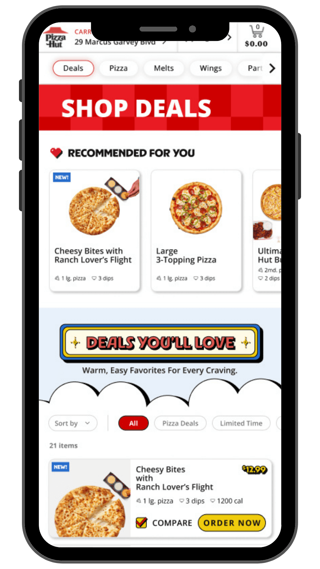
Each phase isolated one behavioral variable, allowing the team to learn what actually improved customer decision-making before layering in richer merchandising, branding, and personalization.
Phase 1
Tile Foundation
Improve decision confidence

Phase 2
Deal Discovery
Support exploration
Discovery Badges
Intent-based browsing
Filters & Sorting

Phase 3
Brand Experience
Increase engagement
Rich merchandising
Enhanced imagery
Campaign moments

Phase 4
Personalization
Scale relevance
Adaptive modules
Behavioral ranking
Recommendations

05
EXECUTION
Content
Content
Content
A/B testing the tile foundation design before scaling the experience.
Before investing in richer merchandising or personalization, I wanted to understand a foundational question: can customers understand what's in a deal?


Hypothesis
If customers understand what a deal includes at first glance, they will require fewer exploratory clicks while maintaining (or improving) downstream conversion.thesis
PROCESS
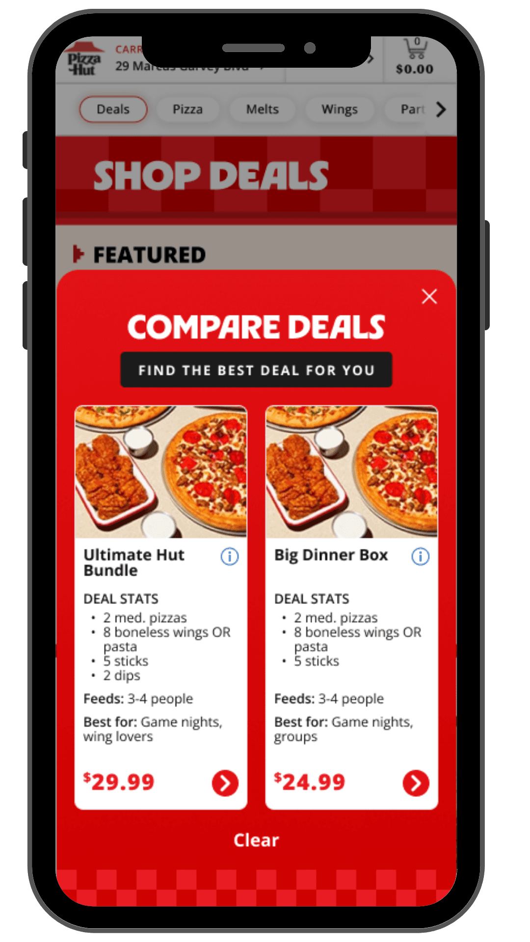
Working with CRO and product teams, I created four concepts to isolate the impact of information hierarchy, deal summaries, and price prominence for Phase 1.
Metrics Tested
CVR, CTR, RPV, AOV
06
RESULTS
Before
Deal contents hidden until entering the builder
Repeated exploratory clicks to compare offers
High cognitive effort before selecting a deal


After
Deal summaries surfaced directly within each tile
Faster value comparison during browsing
Higher decision confidence before checkout
0.76%
-
Exploratory CTR
Fewer exploratory interactions indicated stronger decision confidence and less comparison effort.
0.88%
+
Conversion Lift
Clearer deal comprehension translated into stronger downstream conversion.
0.86%
+
Revenue per Visitor
Customers generated more value despite spending less time exploring.
0.73%
-
Average Order Value
High-value offers naturally attracted more attention, creating an opportunity to improve merchandising distribution in future iterations.
Impact beyond Phase 1
The experiment established an experimentation framework the team could build on. Each following phase introduced one new behavioral hypothesis while preserving what had already been validated.
07
WHAT'S NEXT
Building on the foundation.
Phase 1 proved that clarity improves decision confidence. The remaining roadmap focused on layering discovery, merchandising, and personalization without reintroducing cognitive load.
Phase 1 -> Done
Foundation
Help users understand deals.
Phase 2
Discovery
Help users discover more without thinking harder.
Phase 3

Brand
Create emotional moments after trust has been established.
Phase 4

Personalization
Surface the right deal at the right time.
08
REFLECTION
Clarity changed behavior.
THINGS I BELIEVE NOW
Start smaller than you think.
The biggest improvements came from strengthening the smallest building block of the experience.
Measure customer behavior, not just clicks.
Metrics rarely tell the full story in isolation. Lower exploratory clicks initially appeared negative, but customer behavior revealed this was due to greater customer confidence and reduced decision friction.
Build systems, not screens.
The most valuable outcome wasn't a single winning interface, it was an experimentation framework the team could continue learning from.