PIZZA HUT
Big Dinner
Box Bundle


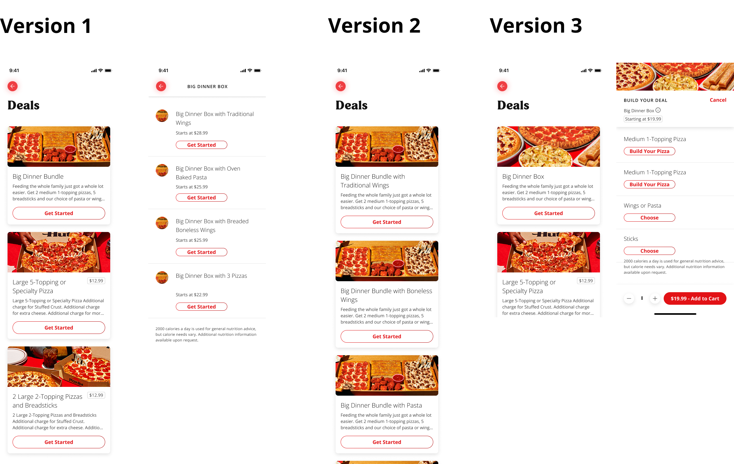
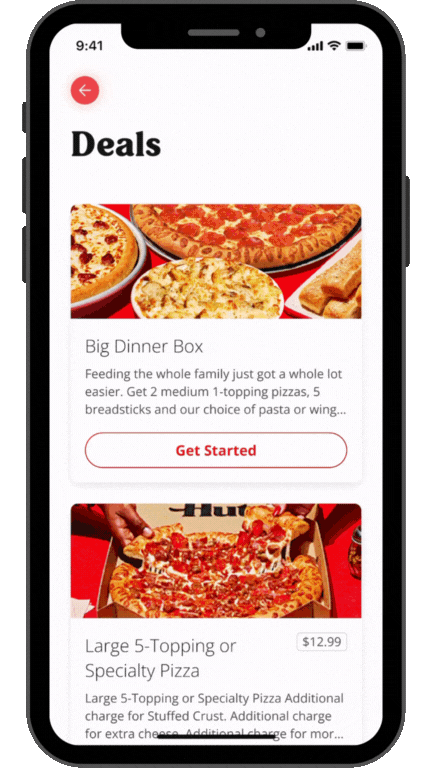
Pizza Hut’s Big Dinner Box, a popular family bundle, was split into four separate ordering flows across app and web. This inconsistency confused customers, created friction in checkout, and caused operational headaches for stores managing variations of the same product. To address this, I redesigned the experience into a single multi-step builder with clear upgrade options — and formalized it as a reusable design system pattern that now powers all bundle flows.
Role
Senior UX Designer
Team
Pizza Hut UX Team
Tools
Figma
Timeline
3 weeks
Project Overview
How might we redesign Pizza Hut’s ordering experience to simplify complex bundle flows, improve clarity for customers, and build scalable patterns that support both app and web ordering at a national scale?
As the lead UX designer, I spearheaded the redesign of the Big Dinner Box (a popular family-style meal). The ordering process was fragmented into four separate variations, causing confusion for customers and inefficiencies for store operations. By consolidating these into a single multi-step builder with upgrade options, I introduced a reusable pattern into the design system that simplified ordering for customers and created consistency for 6,800+ stores nationwide.
The Problem
Bundle meals like the Big Dinner Box were split into multiple variations, confusing customers and creating inefficiencies for store operations.
The existing swap-only pattern didn’t match how users thought about customizing, leading to frustration and abandoned carts.
Visual treatments (pricing, CTAs, imagery) lacked consistency across app and web, reducing clarity and conversion.
Store and call center tools were outdated, causing errors and inefficiencies in managing orders and customer complaints.
The Solution
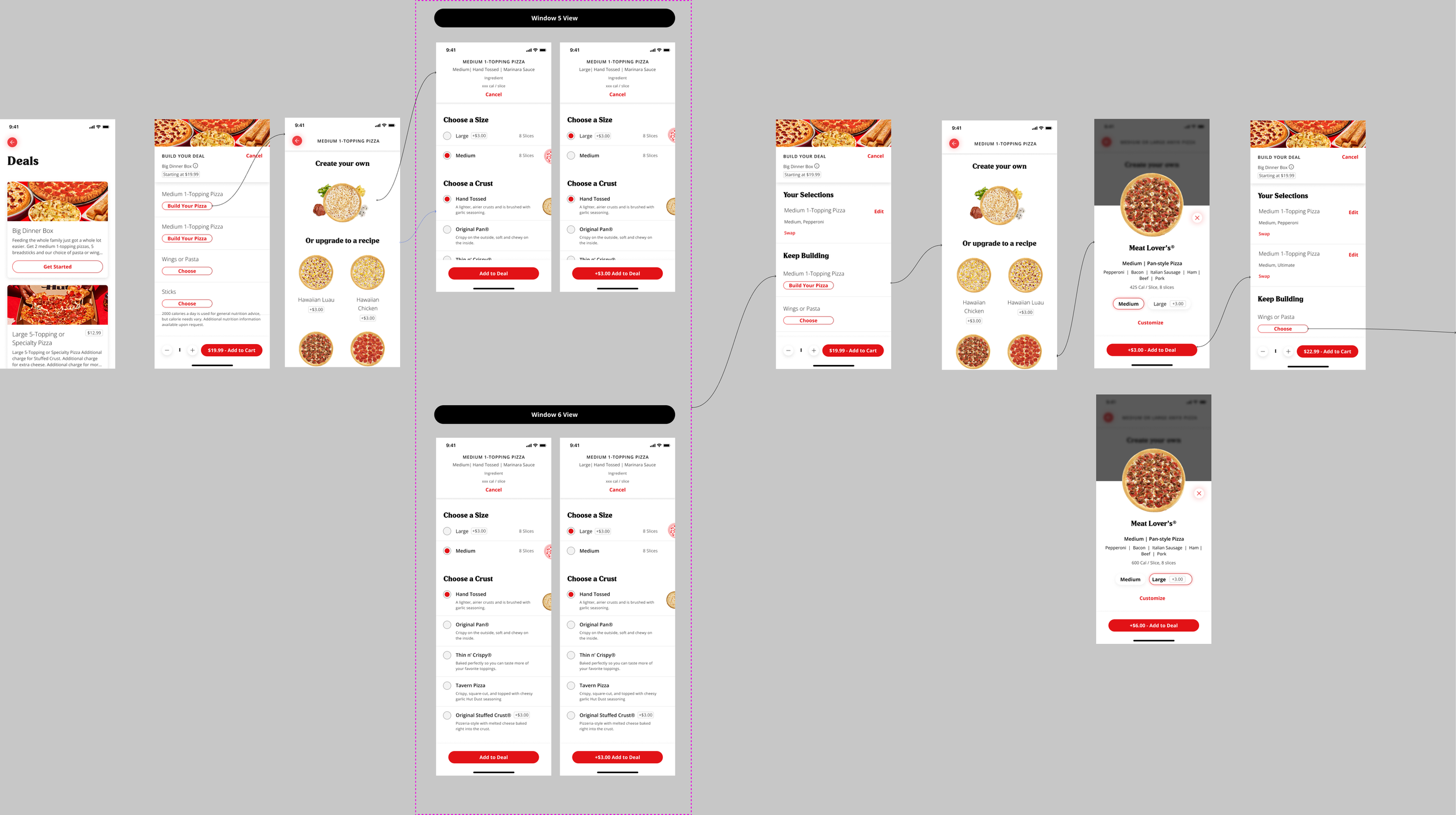
Multi-Step Bundle Builder: Consolidated four fragmented flows into a single, guided builder with clear upgrade options. Added the pattern to the design system for reuse across all bundles.
Background
Before redesigning the Big Dinner Box experience, it was crucial to understand both the customer pain points in bundle ordering and the operational challenges for franchise owners managing multiple order formats.
I collaborated with product managers, researchers, and store operations stakeholders to analyze how customers interacted with Pizza Hut’s most popular bundle. The existing system had four different flows, each with inconsistent steps. Customers often abandoned carts mid-flow, while store managers had to deal with different order structures depending on the variation.
In addition, design audits revealed there was no standardized pattern in the design system to support multi-step bundle orders, which created inefficiencies for both the design and engineering teams
Target User Persona

The typical customer ordering a Big Dinner Box is a family or group looking for value and convenience
They want to customize pizzas, sides, and add-ons quickly without confusion.
When flows are inconsistent or overly complex, they abandon carts and turn to competitors.
Process
1. Comparative Flow Audit
I began by mapping all four existing Big Dinner Box flows side by side.
Each variation had different step orders, inconsistent UI patterns, and unclear upgrade pathways.
For example, some flows asked customers to pick pizzas first while others started with sides, which confused users and caused drop-offs. This audit highlighted the need for one consistent, scalable journey.

2. Wireframes & Early Prototypes
Using insights from the audit, I sketched and prototyped multiple approaches for a unified builder.
I explored variations in step order (pizzas first vs. sides first), different upgrade prompts, and various stepper styles.
A key design debate emerged around the “swap” vs. “edit” interaction model.
Historically, bundles used a swap-only pattern, meaning customers could replace an item but not edit its details.
I challenged this approach, arguing it didn’t align with users’ mental model of customizing food. Instead, I proposed an edit interaction that let users adjust items more flexibly, reducing friction and rework.

3. Usability Testing
I partnered with the Pizza Hut research team to validate the new step sequence options.
The testing confirmed that a linear, guided stepper (pizzas → sides → upgrades → review) best aligned with users’ mental model of “building a meal.”
Customers appreciated clear upgrade prompts and the ability to review the full box before checkout.
4. Design System Integration
Once validated, I partnered with engineers and product owners to break the builder into modular components:
Stepper (to guide users through customization)
Customization step menus (for the different variations)
Upgrade states (e.g., larger size or premium crusts)
Review module (to confirm choices before checkout)
In addition to the builder itself, I also introduced the swap vs. edit pattern into the design system. This created a standardized way for customers to interact with menu items across bundles, not just for the Big Dinner Box, but also for multi-category builders like wings (traditional vs. boneless) and pasta. By codifying it at the system level, the pattern became reusable across all future bundle flows, ensuring consistency and reducing design debt.
Solution
E2E Prototype, current experience in production in select markets
I designed and shipped a unified multi-step builder for the Big Dinner Box, consolidating four fragmented menu variations into one guided flow across Pizza Hut’s app and web. The new experience included clear customization and upgrade options, helping customers build their meal step by step with greater clarity and confidence.
To ensure long-term scalability, I formalized the builder as a reusable design system pattern, making it the foundation for all multi-step bundles moving forward (including wings, pasta, and future promos). This reduced duplicate design work, improved operational efficiency for 6,800+ stores, and gave teams a standardized approach for complex ordering flows.
A key design decision within the builder was rethinking the swap-only menu pattern. Historically, users could only swap an item, which forced them to redo choices if they wanted small adjustments. I challenged this convention and reframed it around the customer’s mental model of editing their order. Through usability testing, the edit-first approach proved far more intuitive and was adopted into the design system as the new standard.
Together, the multi-step builder and edit vs. swap pattern created a more human-centered ordering experience while strengthening the design system as a scalable platform asset.