Redesigning the Deals Page to Improve Discovery & Conversion


Overview
Redesigned Pizza Hut’s Deals experience (one of the most visited surfaces in QSR) to make value easier to understand, speed up decision-making, and create a scalable system that adapts to national campaigns, franchisee variability, and constant promo changes.
Impact
+0.6% CVR lift in Phase 1 (≈ $3.2M)
Projected +1.4–2.1% CVR lift (≈ $7.5–$11.3M)
Users navigated 47% faster
-36% promo confusion
System ready for global tokenization
My Role
Led UX strategy and design across web + app, partnered with CRO, Analytics, Engineering, Research, Marketing, and Global DS.
Overview
The Deals Page is one of Pizza Hut’s most visited digital surfaces, driving millions of monthly visits. Even a 1% lift equates to ~$5.4M annually, making this a high-stakes business surface.
This project reimagined the Deals experience as a revenue driver, not a browsing page, helping customers understand value faster, decide with confidence, and convert with less friction, all during a major brand replatform.
Research-Backed Problem
Partnering closely with UX Research, we uncovered a consistent truth:Customers didn’t understand our deals.
Research findings showed users struggled to:
Understand what each deal included
Compare deals quickly
Feel excited or confident choosing one
The page felt dense, repetitive, and visually noisy, causing confusion, hesitation, and mid-scroll drop-offs, exactly where conversion mattered most.
Hypothesis
If we redesign deal tiles to prioritize scannability, visual differentiation, and clear value communication, users will more easily compare options and convert faster.
Design Strategy: Emotional Decision-Making
I reframed the challenge as an emotional design problem, not just a usability one.
The goal:
Reduce anxiety at the moment of choice
Increase confidence through clarity and contrast
Make value obvious without requiring effort
This shifted the experience from “reading deals” to understanding value at a glance.
Execution: UX, Visual Craft & Systems Thinking
I took a hands-on, end-to-end approach to ensure the experience actually worked in-market:
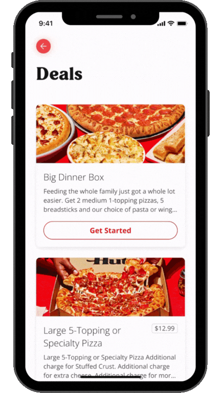
Defined deal tile anatomy (hierarchy, layout, interaction patterns)
Led and directed deal photography, ensuring imagery clearly communicated quantity, value, and appetite appeal
Introduced compare-and-contrast mechanics to support faster evaluation
Applied a “pizza calculator” mental model to make value tangible (how much food, for how many people)
Translated evolving brand guidelines into scalable digital patterns and tokens
This work became a foundational system, not a one-off redesign.

Roadmap & Alignment (Turning Spin Into Progress)
There was early pressure to “blow up” the Deals Page entirely. While well-intentioned, a full overhaul wasn’t sustainable given traffic volume, franchise variability, and an active rebrand in flight.
I led the shift toward a phased, test-and-learn approach that balanced momentum with scale, creating a UX strategy roadmap that:
Identified which problems needed immediate intervention (deal comprehension, differentiation, decision speed)
Sequenced changes into low-risk, high-impact phases
Allowed the team to move forward without waiting on perfect alignment
Reduced risk while still enabling meaningful progress
This approach helped manage competing opinions, maintain forward velocity, and ensure each change could be validated before expanding further.
Directional Impact
+0.6% CVR lift in Phase 1 (~$3.2M annualized)
Projected +1.4–2.1% CVR lift (~$7.5–$11.3M)
Users navigated 47% faster
–36% promo confusion
System ready for global tokenization and scale
Most importantly, the Deals Page evolved from a source of confusion into a clear, confidence-building decision moment.